The standard dimensions of a letterhead are typically 8.5 x 11 inches (216 x 279 mm) for the US and Canada, which matches the standard letter paper size in these regions. In most other parts of the world, A4 size--measuring 210 x 297 mm--is generally used for letterhead design. Using these standard sizes ensures that your business correspondence appears professional and can be easily filed or mailed. Always check your printer's specifications as well, so that your letterhead design aligns perfectly with the intended paper size for a polished final output.
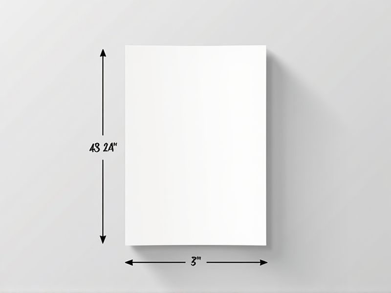
A4 Size
The standard size for letterhead is A4, measuring 210 mm x 297 mm, which is widely used for business documents. This format provides ample space for branding elements, such as logos and company information, while ensuring that your correspondence maintains a professional appearance. Typically, letterheads feature a margin of about 1 inch, allowing for readability and clean presentation. Using A4 letterhead can enhance your brand identity, making your communications more recognizable and cohesive.
Letter Size
A standard letterhead typically utilizes an 8.5 x 11-inch letter size, which aligns with the common dimensions used in office environments. This size accommodates essential elements such as your logo, business name, contact information, and address while maintaining a professional appearance. For optimal readability, it's recommended to leave at least 0.5 inches of margin on all sides. By adhering to these dimensions, you ensure that your correspondence is visually appealing and properly formatted for printing or digital use.
Margins
Letterhead standards emphasize the importance of margins, which ideally should be set to at least 0.5 inches on all sides to ensure content is properly framed. A standard letterhead typically measures 8.5 x 11 inches, so maintaining adequate white space enhances readability and professionalism. For a polished look, consider incorporating a consistent margin of 1 inch for top headers or logos, providing a balanced visual presentation. Your letterhead design should align with branding guidelines, ensuring that font size remains legible, typically between 10 to 12 points.
Header And Footer
A standard letterhead typically features a professionally designed header that includes your company logo, name, and contact information, ensuring brand consistency and recognition. The footer often contains essential details, such as the company's address, website URL, and social media handles, providing easy access to more information. By maintaining a visually balanced layout, with the header and footer complementing each other, you create a polished appearance that enhances the credibility of your correspondence. This structured approach not only impresses recipients but also reinforces your brand identity each time a letter is viewed.
Bleed Area
When designing a letterhead, the bleed area is crucial for achieving a professional finish. Typically, a standard bleed area extends 0.125 inches (3 mm) beyond the document's final size, ensuring no unprinted edges appear after trimming. This is especially important for designs that include backgrounds or images that reach the edges of the letterhead. To maximize impact, make sure your artwork fills the bleed area, creating a seamless appearance once printed.
Safe Zone
The safe zone for a letterhead typically measures 0.5 to 1 inch from the edges, ensuring that critical information remains visible and uncut. This area is crucial for maintaining the professional look of your correspondence, as it prevents essential elements from being trimmed during printing or framing. Ideally, your logo should be positioned within this zone, enhancing brand visibility while ensuring clarity. To maximize reader engagement, include your contact details and social media handles without infringing on the safe zone boundaries.
Print Resolution
A standard letterhead should maintain a print resolution of at least 300 DPI (dots per inch) to ensure clarity and professionalism. This high resolution guarantees that your logo and any graphic elements appear sharp and detailed, enhancing your brand's credibility. For most letterhead designs, an ideal size is 8.5 x 11 inches, fitting standard stationery. Remember, using vector graphics for logos can help maintain quality across various sizes, ensuring your branding remains consistent.
Paper Weight
When selecting a letterhead, paper weight is crucial for conveying professionalism; a standard weight ranges from 24 lb to 32 lb. Heavier weights, such as 28 lb and above, provide a more substantial feel, enhancing perception of quality. For everyday correspondence, a 20 lb to 24 lb paper is commonly used but may not leave a lasting impact. Choosing the right weight not only influences the tactile experience but also affects ink absorption and print quality, ensuring your message stands out effectively.
Color Space
A high-quality letterhead typically utilizes a color space that adheres to the CMYK (Cyan, Magenta, Yellow, Key/Black) model, which is ideal for print materials. Using the RGB (Red, Green, Blue) color space can result in discrepancies when printed, as it is primarily designed for digital screens. For optimal visual consistency, ensure that your letterhead's colors are calibrated to maintain a balance of vibrancy and professionalism, often achieved with a 300 DPI resolution. When designing your letterhead, consider incorporating a color palette that aligns with your brand identity, potentially featuring 2 to 4 complementary colors.
Typography Standards
Typography standards for letterhead design emphasize clarity and professionalism, typically using typefaces like Helvetica or Times New Roman, which enhance readability. Maintain a font size of at least 10-12 points to ensure that all text remains legible at a standard letter size of 8.5 x 11 inches. Incorporating a hierarchy through different font weights and sizes can guide the reader's attention effectively to essential information such as your name, title, and contact details. Remember that consistent alignment and appropriate spacing contribute significantly to the overall aesthetic, ensuring your letterhead reflects the quality of your brand.